Angela’s Cafe
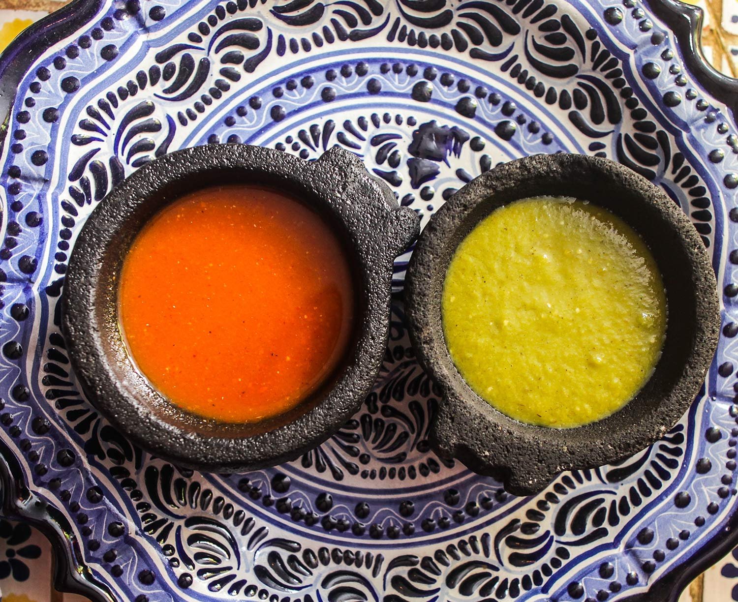
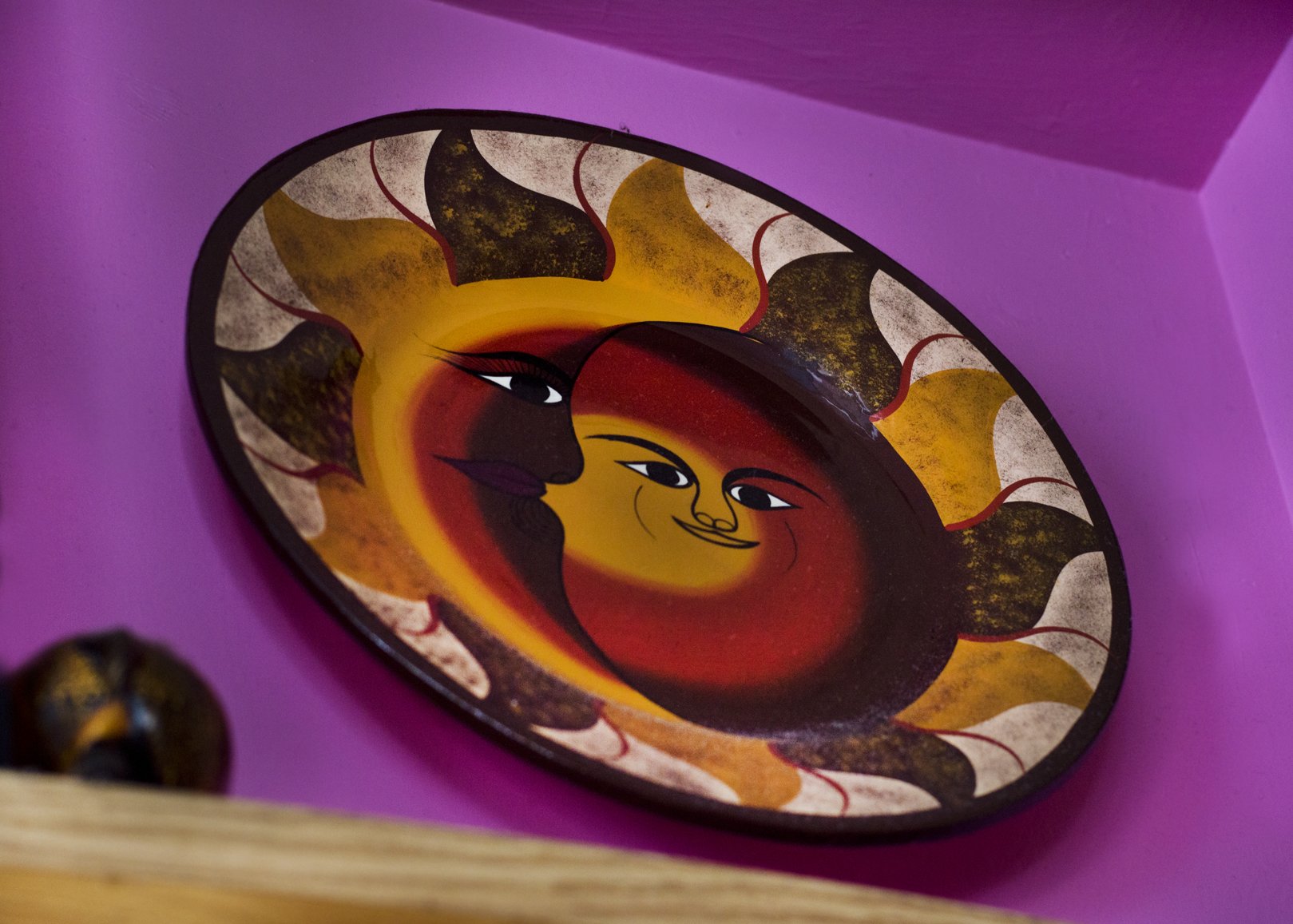
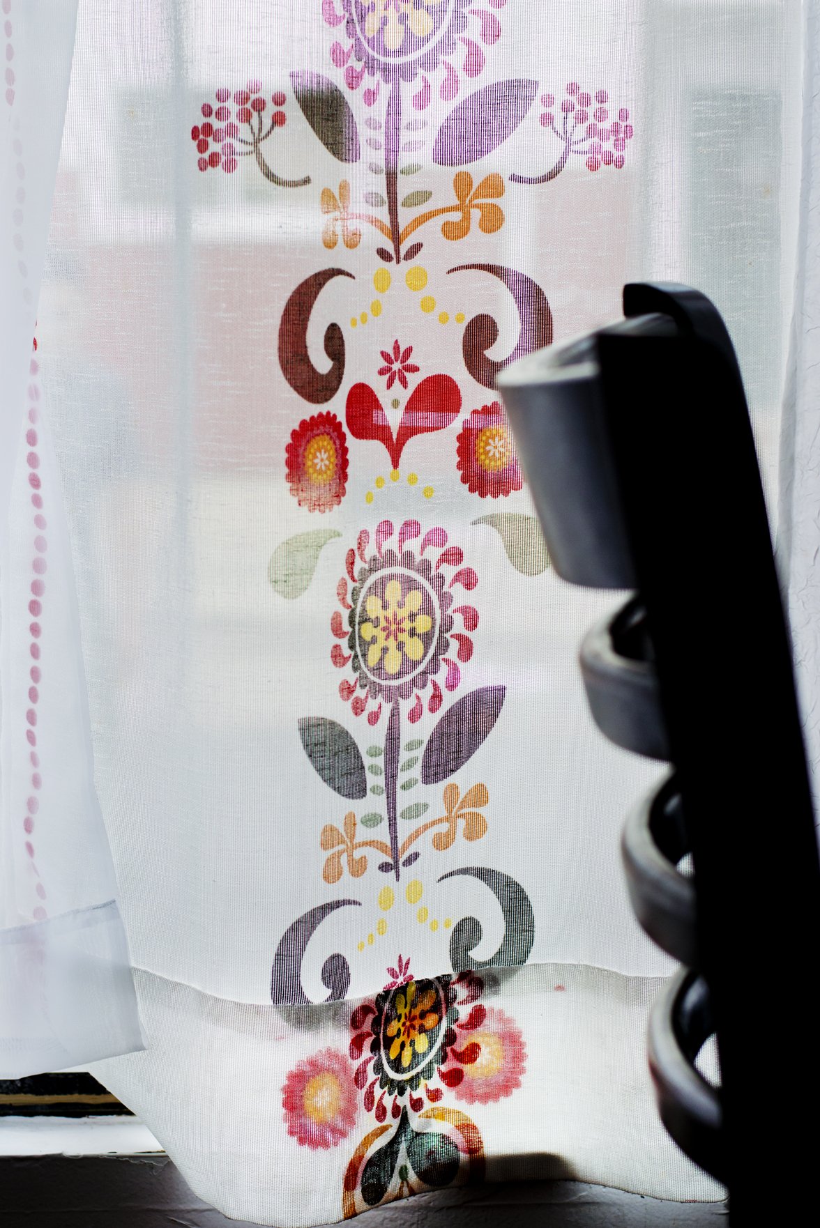
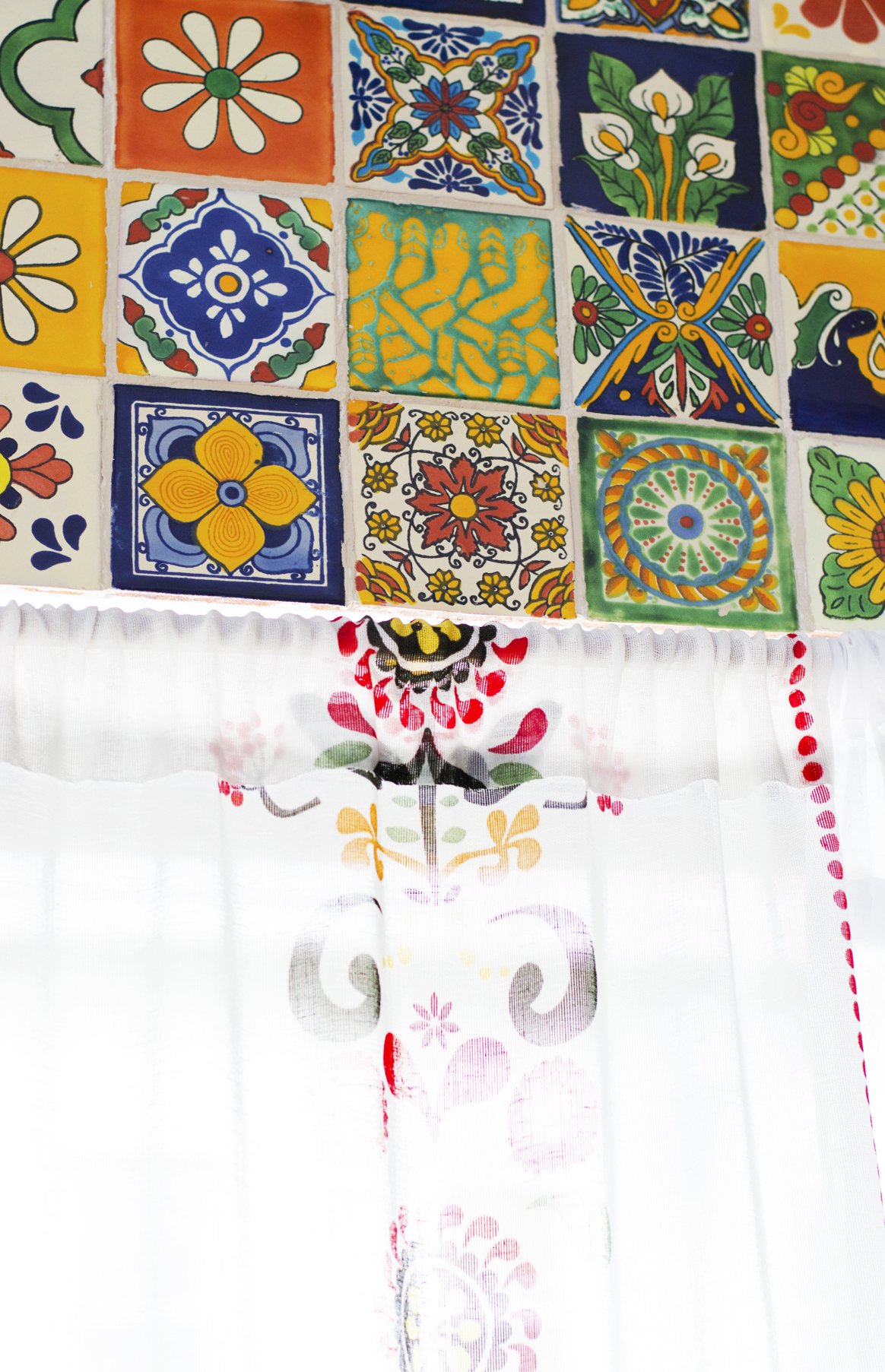
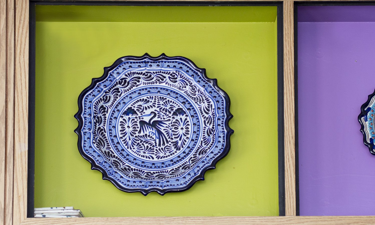
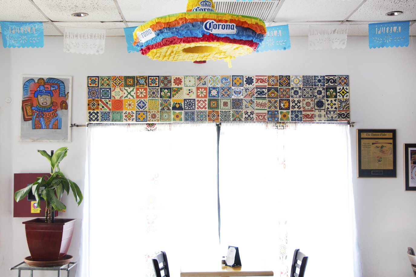
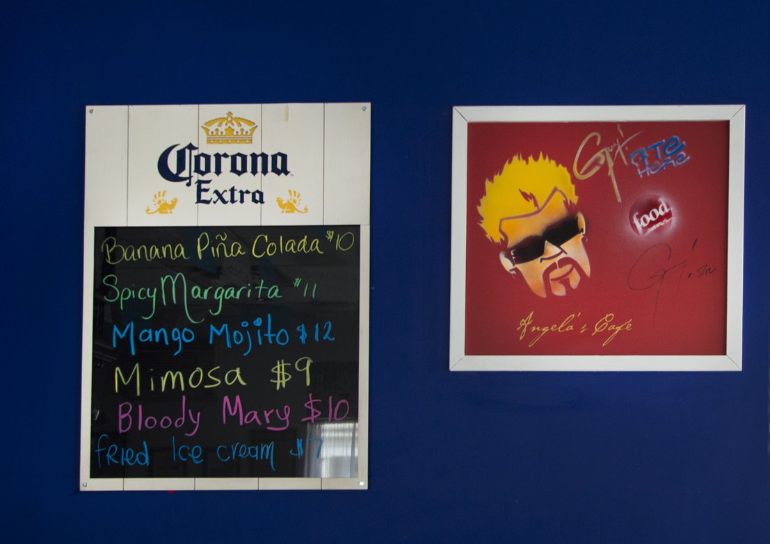
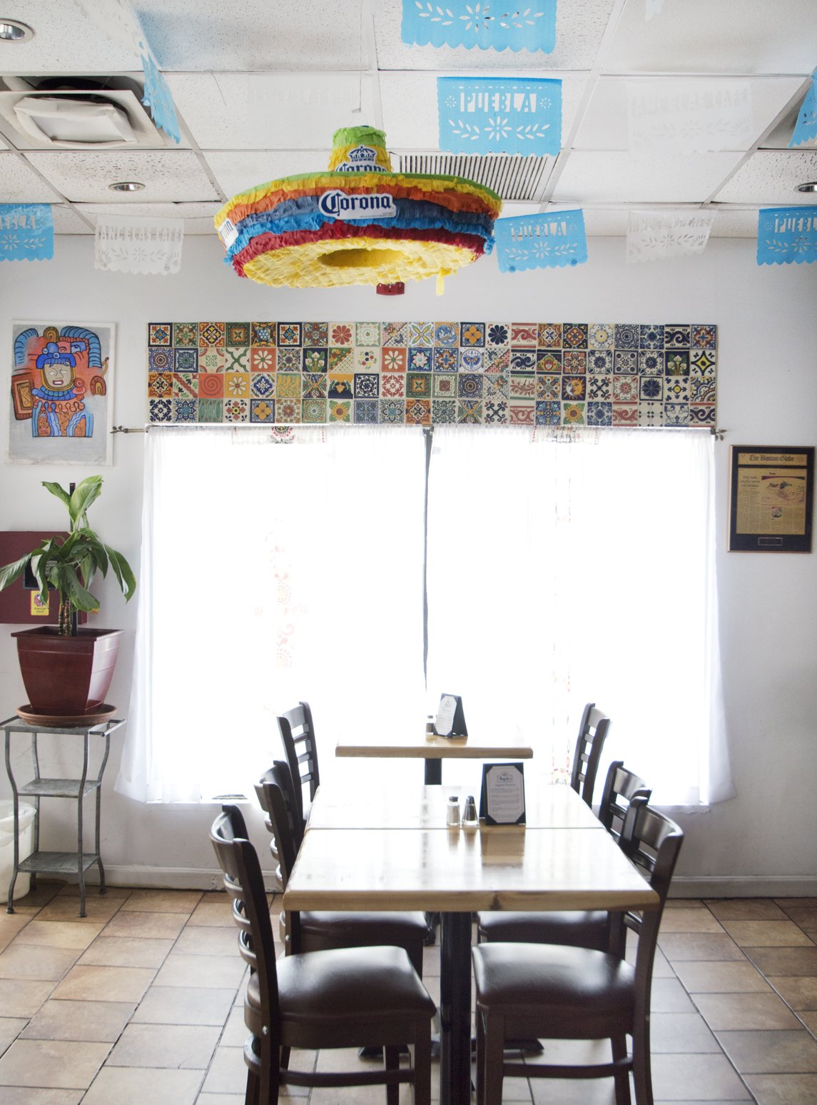
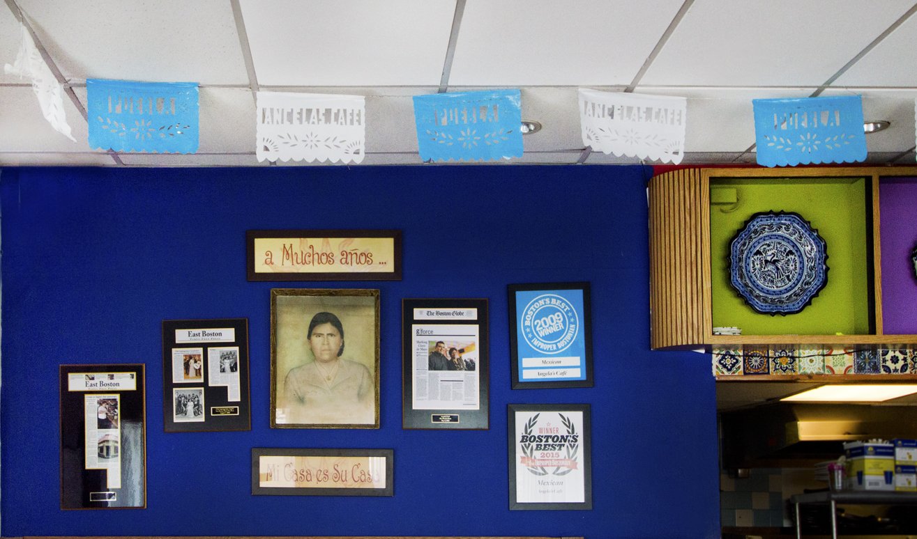
A taste of Puebla through Design - Angela's Cafe restaurant branding included selecting a brand color scheme and using the different aspects of Puebla culture to create the atmosphere of both the brand and the physical location.
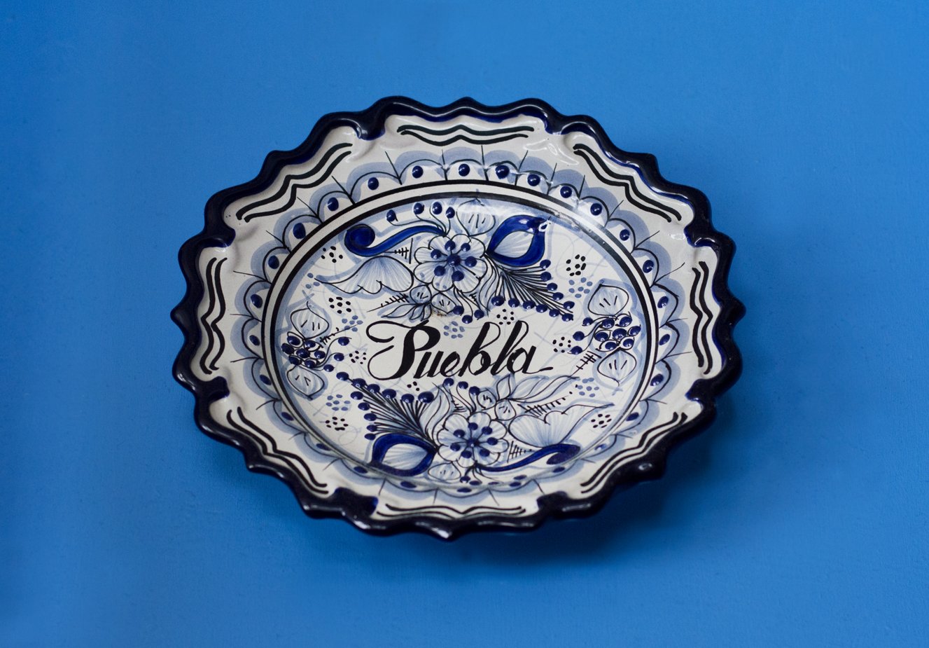
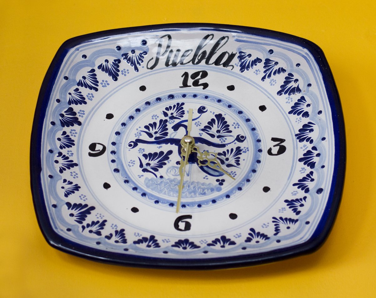
A new logo design following the handwritten style of Talavera crafts from Puebla and incorporating that font into a 'ranchero' style sign give you an insight into Puebla's essence.
-
Client: Angela’s Cafe
Industry: Hospitality
Deliverables:
• Branding
• Art Direction
• Photography
• WebsiteTeam:
Sonya Highfield Photography
Our Goal
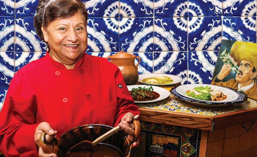
As a Boston favorite go-to cafe for cozy dine-ins, the main goal for Angela’s Cafe is to show the cheerfulness of the restaurant all while showing the deliciousness of their specially crafted traditional Mexican dishes hailing from Puebla. Small, cheerful restaurant crafting traditional Mexican dishes hailing from Puebla.